Pick up two boxes that cost exactly the same to make and hand them to someone blindfolded, and they’ll probably still be able to tell you which one feels more expensive. Weight, texture, the way a lid closes with that soft resistance instead of a cheap click – none of that happens by accident. Luxury packaging is essentially a discipline built around making a product feel like more than it actually is, before anyone’s even seen what’s inside.
I’ve looked at a lot of packaging over the years, and the thing that stands out most about the premium stuff is how much restraint goes into it. It’s not about piling on decoration. It’s usually the opposite – fewer elements, done really well, with a lot of attention paid to details most people wouldn’t consciously notice but would absolutely feel if they were missing. That’s the whole point. Someone opens a box and just gets this sense that care went into it, even if they couldn’t explain why.
Why Luxury Packaging Works Differently Than Everything Else
Regular retail packaging is mostly built to grab attention fast, in a busy environment, competing with a dozen other products. Luxury packaging plays by different rules entirely. A lot of the time it isn’t even sitting on a shelf next to competitors. It shows up in someone’s hands after they’ve already bought the product, or it’s part of an unboxing experience that’s meant to be slow and deliberate.
Because of that, the goals shift. It’s less about screaming for attention and more about reinforcing a decision someone’s already made. Good luxury packaging makes the buyer feel like they made the right call spending what they spent. That’s a completely different job than trying to win someone over in three seconds on a crowded shelf, and it changes almost every choice that goes into the design.
Materials Are Where It Starts
You can’t fake premium with cheap material, not really. People pick things up. They notice weight, rigidity, how a surface feels under their fingers. Rigid board is the backbone of most high-end packaging because it holds its shape and has a certain heft that flimsy folding cartons just can’t match. It’s more expensive to produce, but that cost is basically the point.
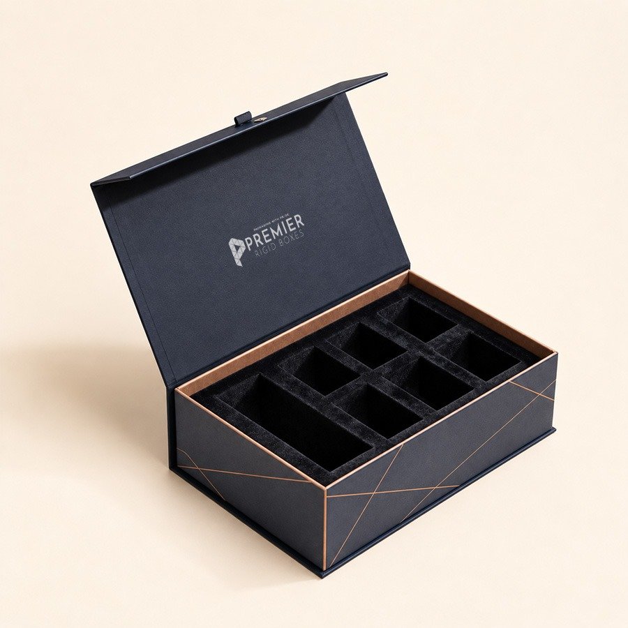
Beyond the base structure, a lot of premium packaging layers on additional materials. Fabric wraps, textured papers, wood accents, even magnetic closures instead of tape or glue. Every one of those choices adds cost, sure, but they also add sensory detail, and sensory detail is a huge part of what separates something that feels expensive from something that just looks expensive in a photo.
Design Choices That Actually Matter
Minimalism shows up constantly in luxury design, and it’s not just a trend; it’s a strategy. Clean layouts, generous white space, restrained typography – all of that signals confidence. A brand that needs to cram every inch of a box with information or decoration usually reads as less established, whether that’s fair or not.
Color plays a role too, though luxury brands tend to lean toward muted, deep, or monochrome palettes rather than the loud colors you’d see on a typical retail shelf. Black, deep navy, muted golds, soft neutrals – these show up constantly because they read as timeless rather than trendy, and timeless is generally the goal here, not something that’ll look dated in two years.
Structure matters just as much as the surface design. Magnetic closures, ribbon pulls, drawer-style boxes that slide open rather than just lifting off – these little mechanical details turn opening a box into more of a moment rather than something purely functional. It sounds small, but it’s often the part people remember most.
Finishes Are Where the Details Live
This is where a lot of custom luxury boxes really separate themselves from standard packaging. Foil stamping adds a bit of shine and dimension without needing loud colors to do it. Embossing or debossing adds texture you can actually feel, which matters more than people expect when someone’s holding a box in their hands. Soft-touch coatings give a surface this velvety feel that’s hard to describe but instantly recognizable once you’ve felt it.
Spot UV is another one worth mentioning – applying a glossy finish over just part of a matte surface so certain elements, like a logo, catch the light while everything else stays subdued. It’s subtle, but subtle is kind of the whole language of luxury design. Nothing shouts. Everything’s just deliberate.
Product Information Overview
| Feature | Description |
| Packaging Type | Luxury and custom luxury boxes |
| Common Materials | Rigid board, textured paper, fabric wraps, wood accents |
| Structural Styles | Magnetic closure boxes, drawer-style boxes, lift-off lids |
| Printing Techniques | Foil stamping, embossing, debossing, letterpress |
| Finishing Options | Soft-touch coating, spot UV, matte lamination, gloss lamination |
| Color Palettes | Muted tones, monochrome schemes, deep or neutral colors |
| Ideal Industries | Jewelry, cosmetics, fragrances, high-end electronics, spirits |
| Closure Types | Magnets, ribbon pulls, custom inserts |
| Assembly | Often pre-assembled or rigid, less collapsible than standard boxes |
| Lead Time | Typically 3 to 6 weeks depending on complexity |
Where Cost and Value Actually Line Up
Luxury packaging isn’t cheap, and there’s no getting around that. Rigid materials cost more to source and assemble. Specialty finishes like foil or embossing need extra production steps and equipment. But brands operating in this space aren’t really trying to minimize packaging cost the way a mass-market retailer would. The packaging itself is part of what justifies the price tag on the product inside it.
That said, there’s a difference between spending a lot and spending it well. The strongest luxury packaging usually isn’t the most expensive option available – it’s the one where every material and finish choice actually supports the brand’s identity, instead of just being added because it sounded impressive on a spec sheet. Restraint, again, tends to win out over excess.
Final Thoughts
Luxury packaging isn’t really about looking fancy for the sake of it. It’s a set of deliberate choices – material, structure, color, finish – all working together to create a feeling before a single word gets said about the product itself. Get the materials right, keep the design restrained instead of cluttered, and layer in finishes that add real texture and depth rather than just shine, and the packaging starts doing exactly what it’s supposed to: making someone feel like they made a good decision the moment they pick it up. In categories where perception carries as much weight as the product itself, that kind of packaging isn’t a luxury add-on. It’s a core part of the product.
Frequently Asked Questions
What makes packaging count as “luxury”?
It usually comes down to a combination of premium materials, restrained design, and specialty finishes that create a heavier, more deliberate feel compared to standard retail packaging.
Why does rigid board show up so often in luxury packaging?
It holds its shape well, feels substantial in the hand, and doesn’t collapse or flex the way lighter cardboard does, which matters a lot when the packaging is meant to feel premium.
What’s the difference between embossing and debossing?
Embossing raises a design above the surface, while debossing presses it inward. Both add texture you can feel, not just see, which is a big part of what makes luxury packaging feel different.
Is spot UV the same as regular gloss lamination?
Not quite. Spot UV applies a glossy finish to specific areas only, usually over a matte base, which creates contrast rather than coating the whole surface in shine.